Mixed Media Arts
PROCREATE + MIXED MEDIA
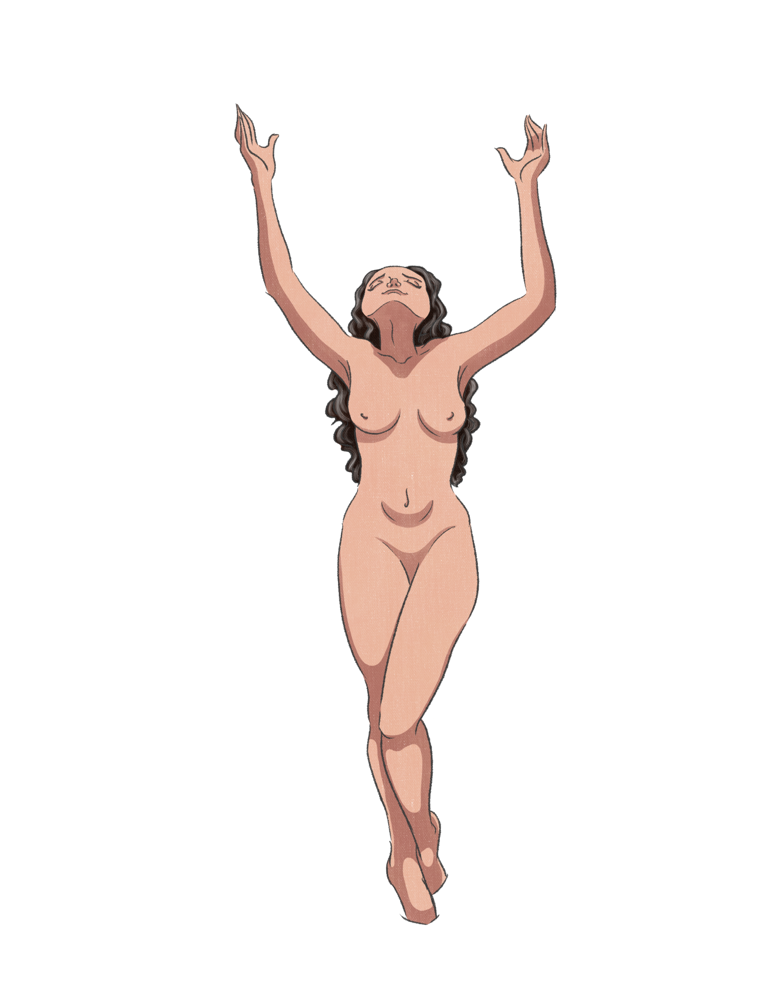
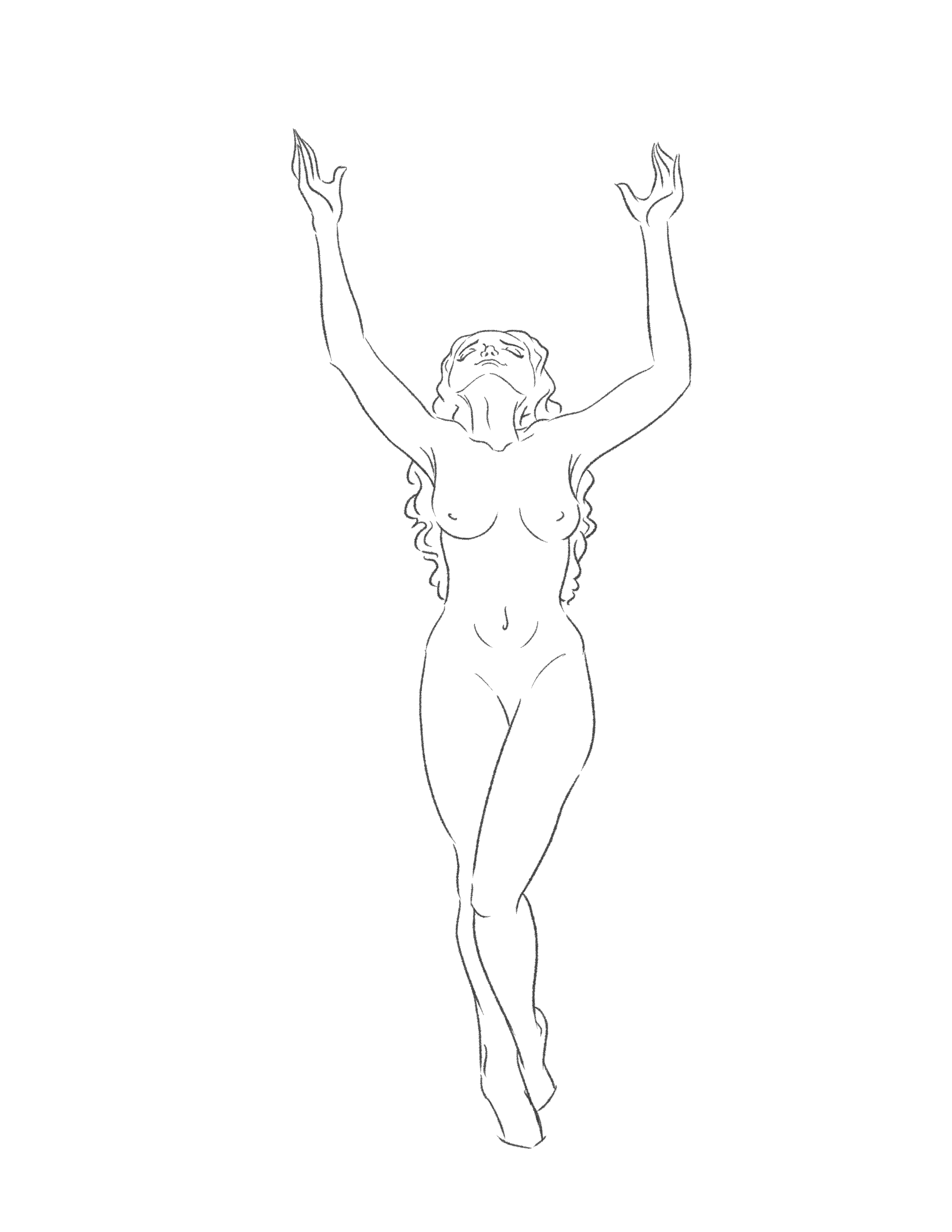
Surrender Yourself
This piece was inspired by the concept of giving your whole self - body and spirit - to God.
( Click and scroll through the pictures to see the creative process )
GOUACHE PAINT + WATERCOLOR
My Own Backyard
COLORED PENCILS + ACRYLIC PAINT
“Man’s Red Flower”
This prompt was to create an illustration of an animal or insect outside of their usual habitat — to be a storyteller and set the character in an environment, while including a deeper meaning to the work as a whole using properties of color theory and staging.
“Man’s Red Flower” is an interpretation of man kindling inhabited forests and clearing wide areas of trees. This monkey is shown as being homeless due to the said issues, and has turned to alcohol as a reliever.
( Click and scroll through the pictures to see the creative process )
2018 // Scratchboard // 26” x 19”
CINDERELLA’S CASTLE
Like many, Disney holds a special, magical place in my heart. Unlike others, however, my passion for the well-established organization has grown strong. From a very young age, I developed a feeling of longing to somehow be a part of this institution. It didn’t take long for me to think of recreating one of the Disney castles on a scratch board material. This piece I’ve created of Cinderella’s Castle, shows a strong contrast of black and white which reflects upon the disparity between reality and fantasy. I relate to this concept, in a sense that if I want to fulfill my dreams, I must work extremely hard. This is reality and everyone must understand that to work towards success, you have to put forth your best efforts. My desire to work for Disney is currently fashioned like a fantasy. It’s a dream. A want. Every intricate detail scratched into this artwork resembles every step I’m taking taking to accomplish my goal.
GOUACHE PAINT + WATERCOLOR
What makes a fish, a fish?
This painting is an assembly of fish in a dynamic two dimensional composition, rendered using gouache. One of the main focuses was to use a bright and playful high chroma color scheme.
We were encouraged to think of wacky ways to create fish — to create a fish figure from musical instruments, office supplies, everyday common objects/materials, etc . . . My thought process was: instead of just “cartoon-izing” my fish drawings, I gave them human caricature heads! I do a decent amount of character design and development within my animations and other illustrations, so I simply incorporated my previous creations within this "What Makes A Fish, A Fish" prompt.
( Click and scroll through the pictures to see the creative process )
ADOBE ILLUSTRATOR + MIXED MEDIA
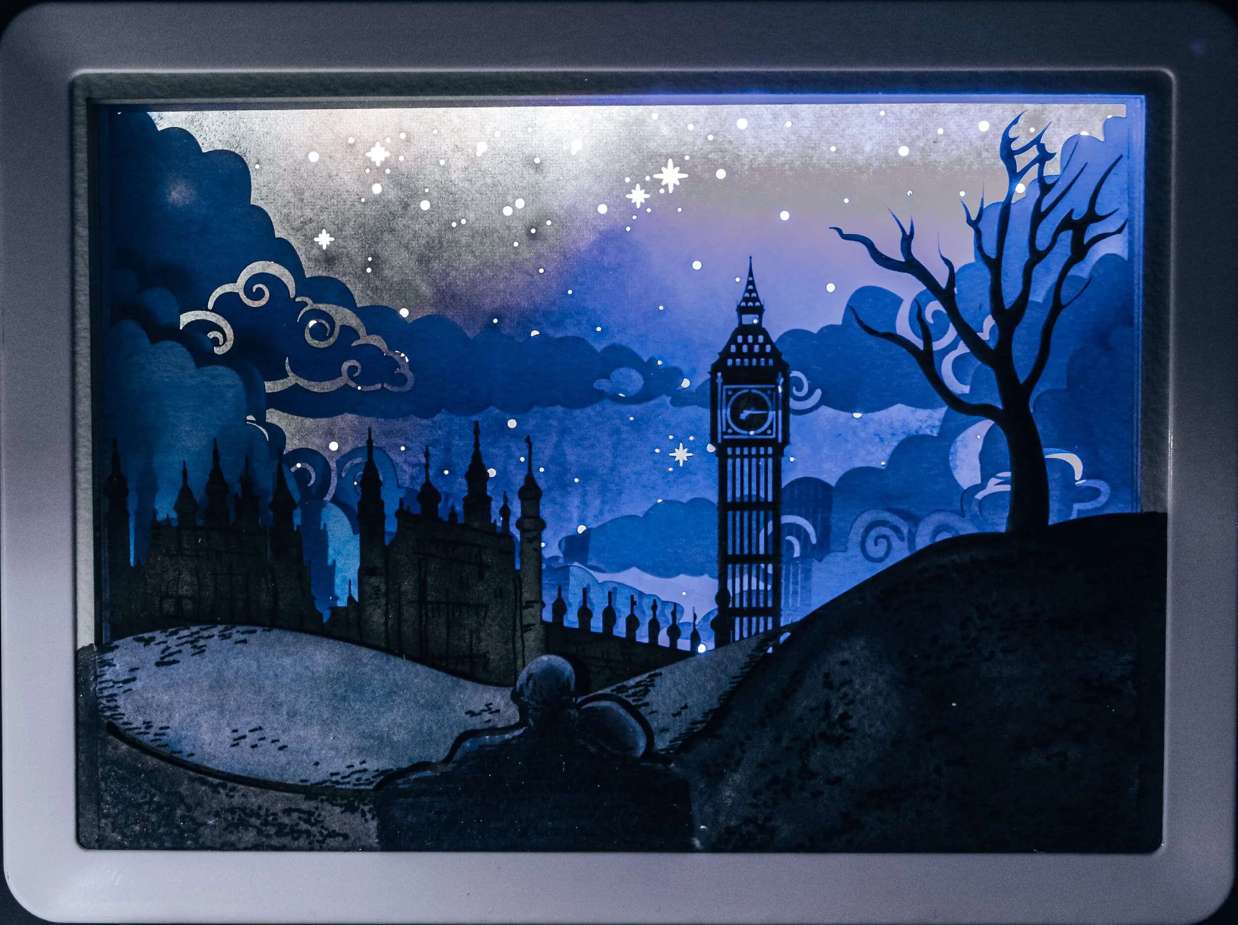
2D/3D MINIATURE PAPER ENVIRONMENT SCENE (WITH CHARACTERS)
This project challenged us to investigate multi-layered, multi-level dimensional pictorial design (i.e.: a miniature stage set, a popup book, a light box, or a shoebox diorama) as a means of presenting a narrative storyline. We had to successfully transition a pictorial graphic concept from 2D to functional 3D paper or mixed media construction, and explore the concepts of character and place as components of a narrative storyline theme. I got the chance to investigate three-dimensional paper construction design and advanced assembly processes via 3D laser cutter.
This was a hybrid media project using programs: Illustrator, Photoshop, and traditional media — which included 2D and 3D design processes. The main objective was to form a three-dimensional pictorial piece and tell a story.
My inspiration for this project came from my wanting to create something with the essence of clouds and to bring about a strong emotional appeal. My mind drifted into the thought of flying, and then to remembering my favorite movie as a child: Disney’s Peter Pan. I’ve always loved the dreamy, playful aesthetic of the film and decided I wanted to recreate this feeling. To get the point across that Peter Pan was the inspiration, I made London my setting and incorporated Big Ben, who makes a strong appearance in the movie. Also, what I’ve hidden in the sky are the two stars that lead the young children to the magical world of Neverland.
Taking into consideration that aesthetics of Peter Pan were at night, I started to think about how I would want to set up my landscape. A specific nighttime scene from Disney’s Lady & The Tramp captured the mood I was looking for. I based my top layer after the romantically lit moment of Lady & Tramp’s date night; I loved the use of blues and I created my own hues to make it unique.
( Click and scroll through the pictures to see the creative process )
2018 // Watercolor // 22” x 16”
Adventure Awaits
Growing up, living on a small farm in the country, it’s hard to imagine life outside of the little bubble I call home. Growing up, my parents put it upon themselves to constantly remind my siblings and I that “There’s an entire world out there that’s waiting for you.” This simple phrase seemed to have shot straight to my heart; it forced me to see my hometown differently. This gave me perspective; and when my parents took off to Europe for a quick getaway, they took a picture of an Italy alleyway. I loved it so much, I painted it in watercolor. Watercolor gave the image a dreamlike state, resembling my dreams of traveling and I hope to someday achieve these goals.
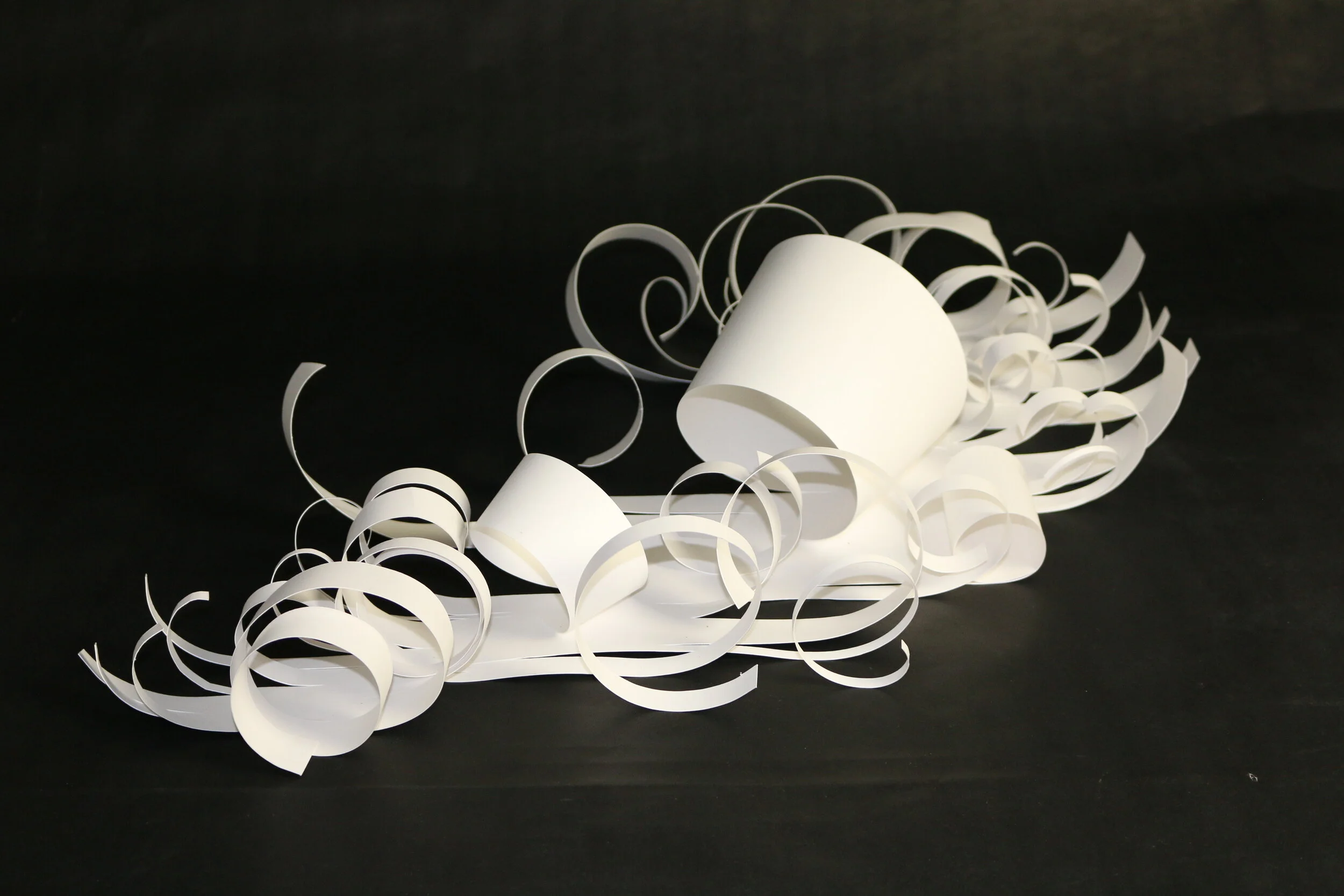
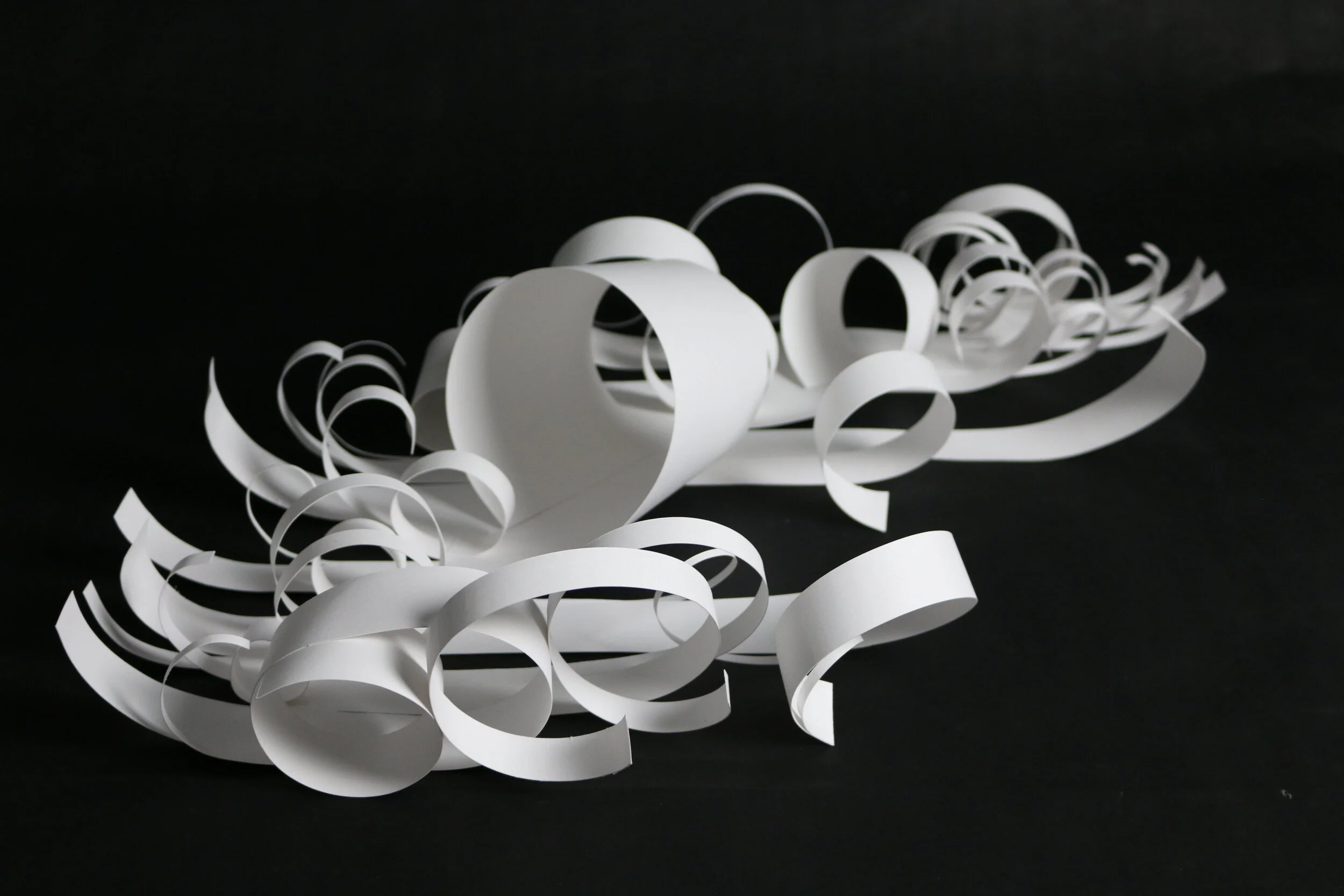
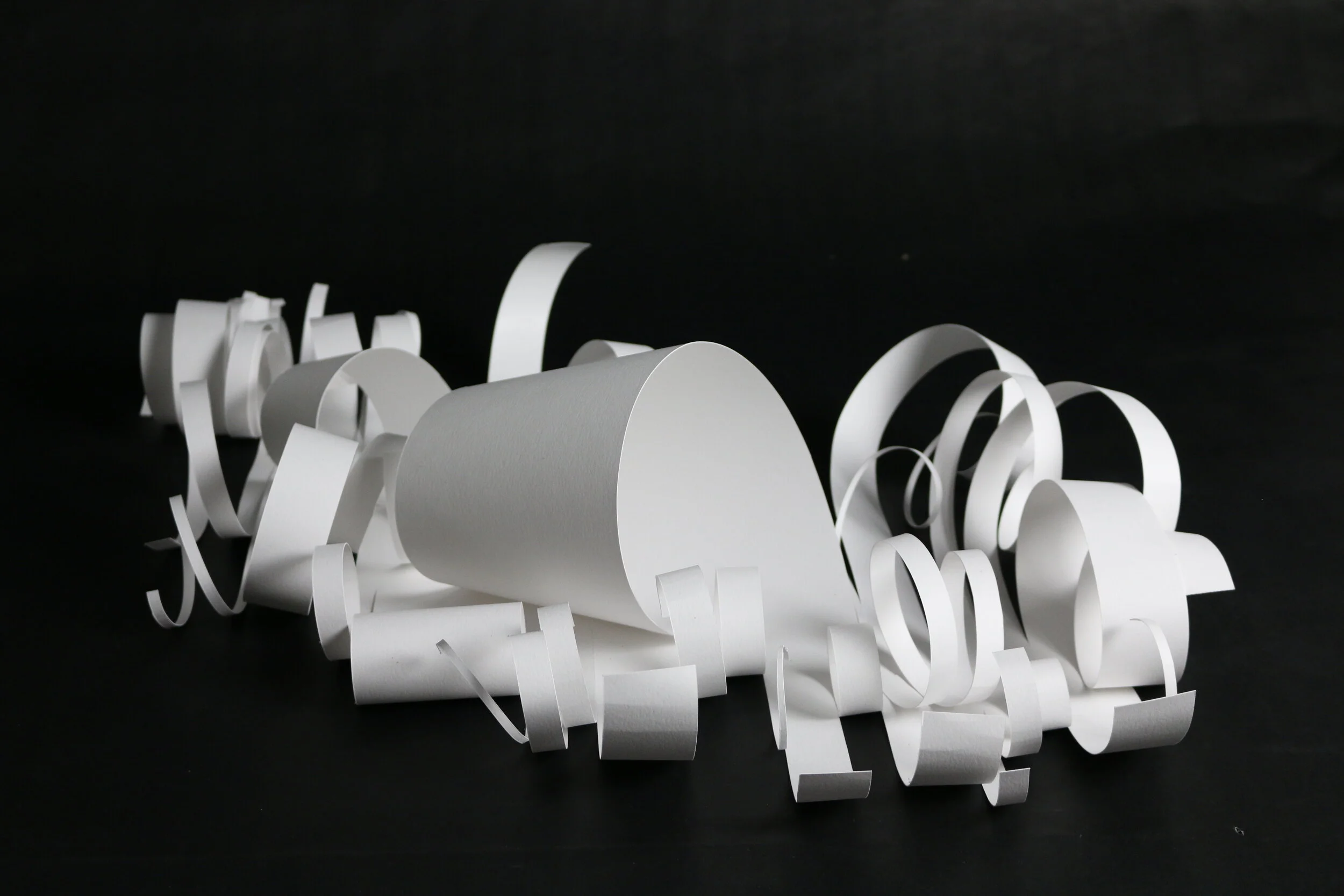
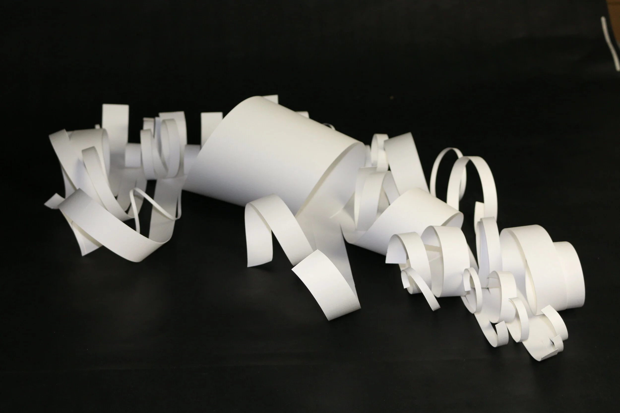
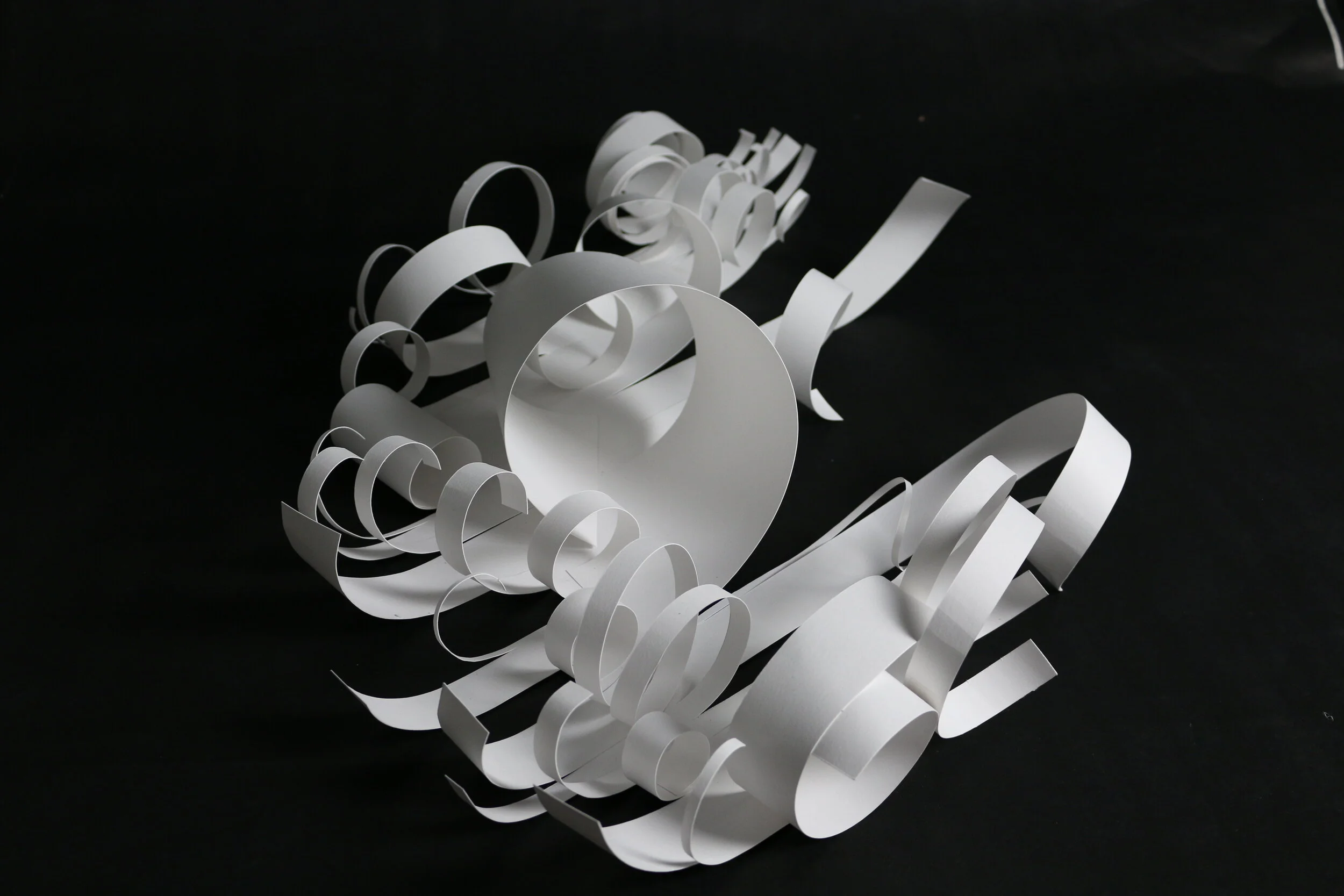
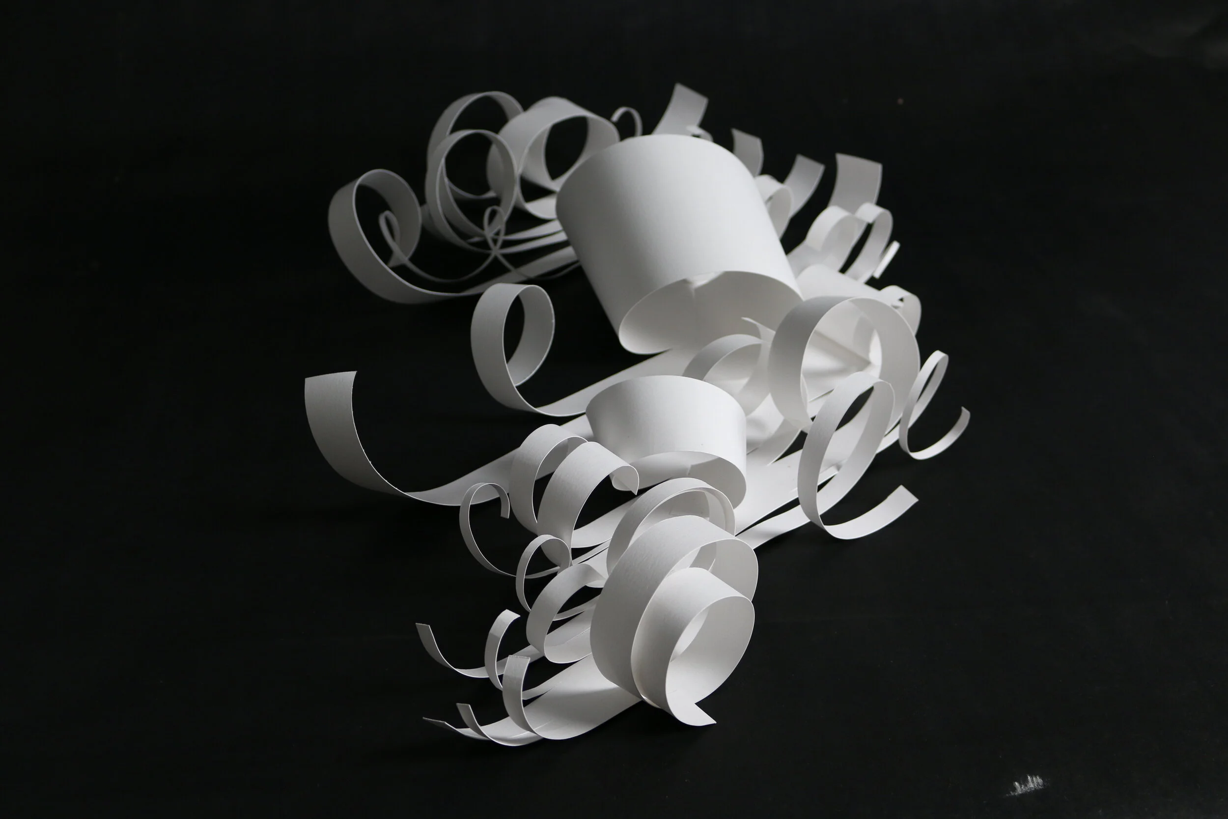
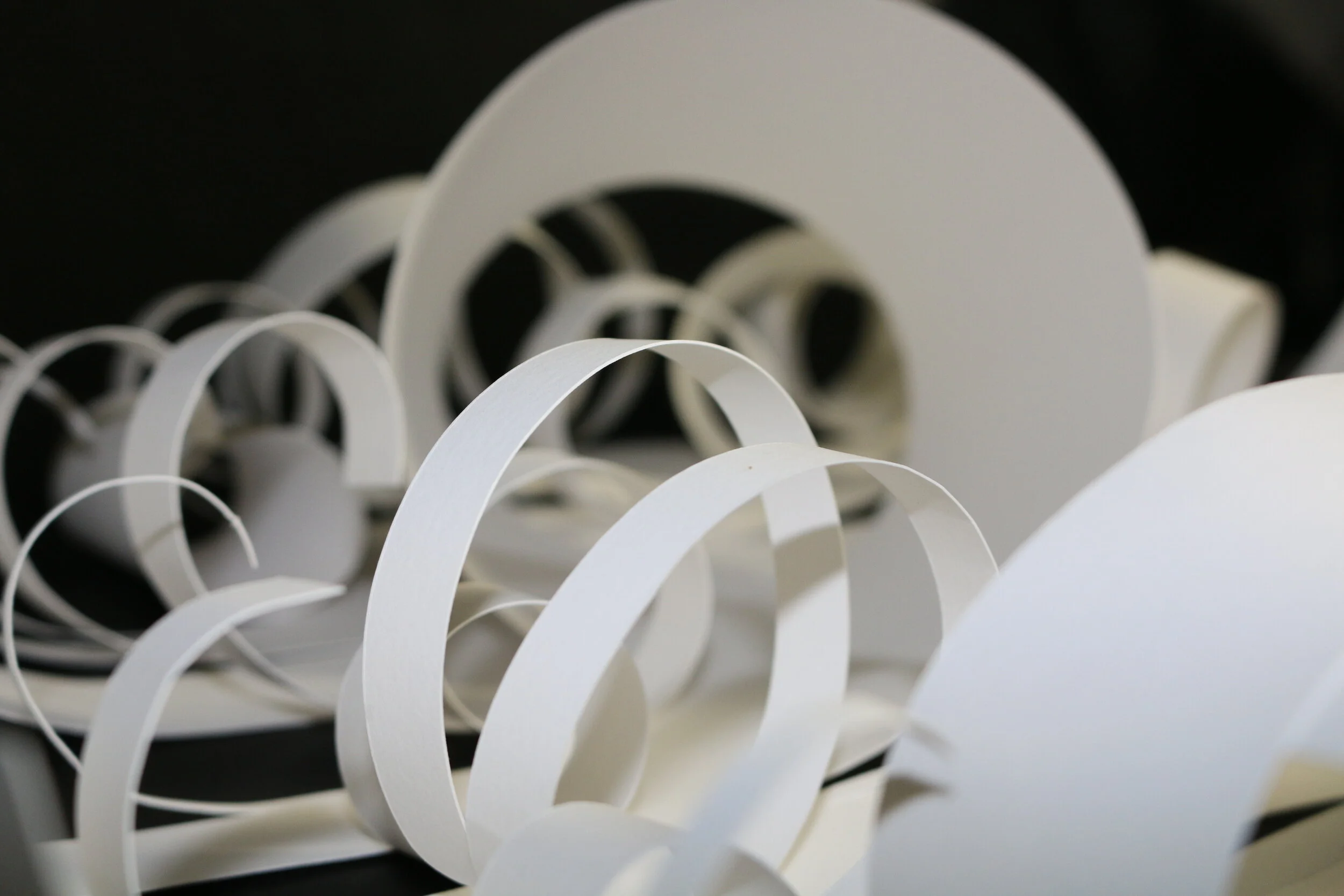
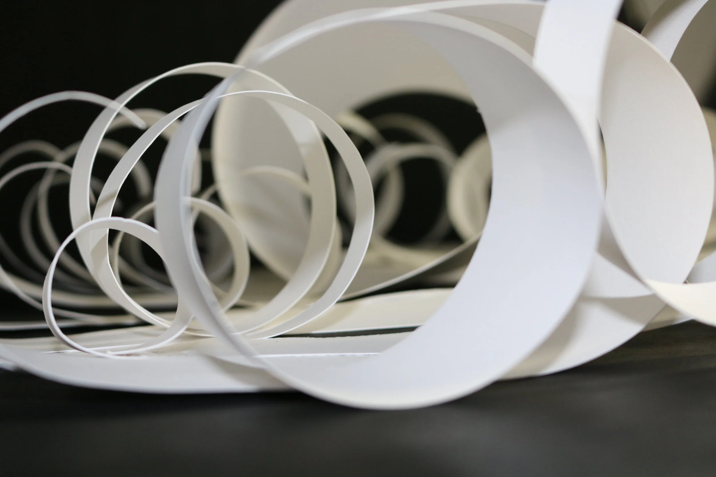
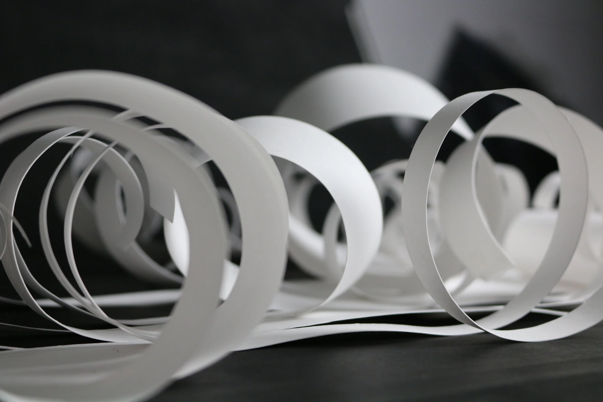
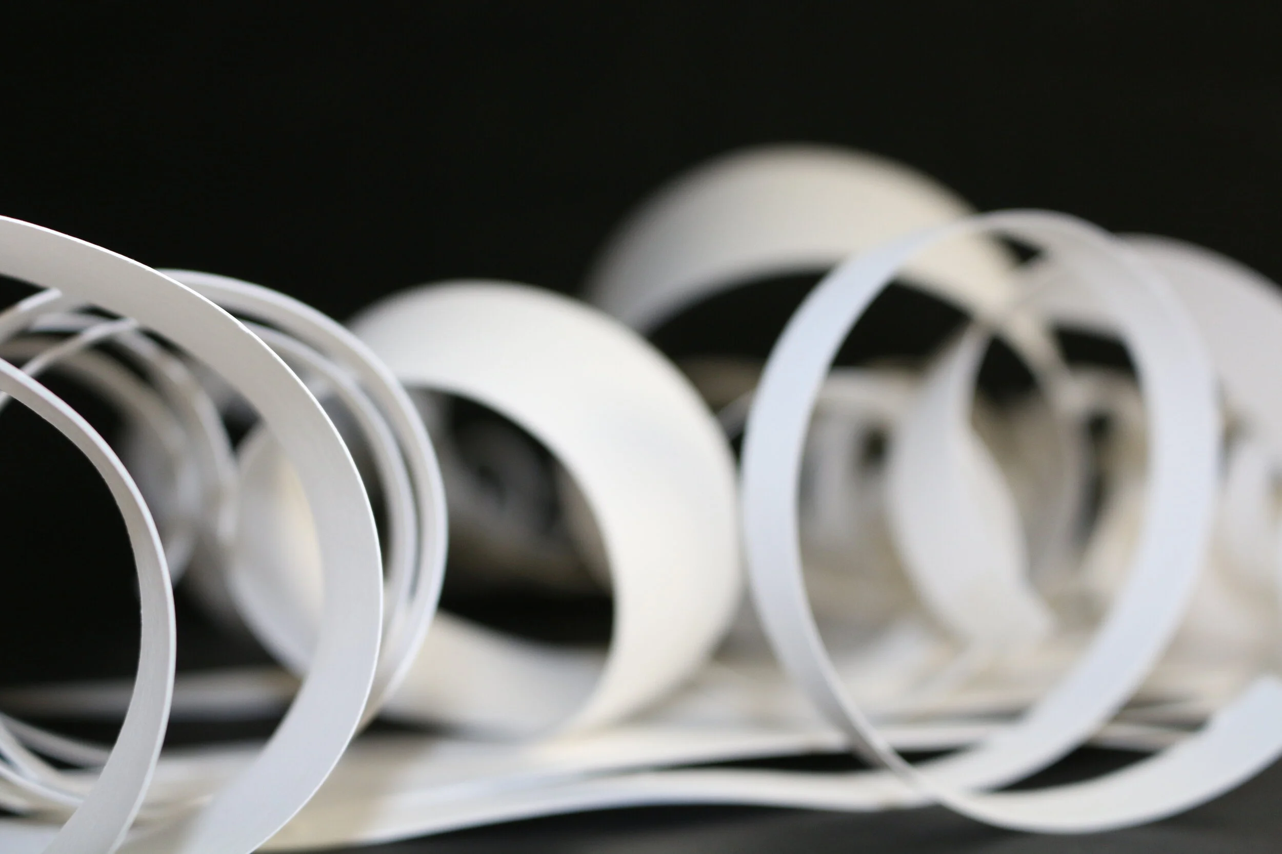
PAPER + SCISSORS
Gestalt Principles
This project forced us to challenge the concept of identify and use gestalt principles of design to discuss, and critically analyze the visual aspects in works of art, including our own.
( Click and scroll through the pictures to see the creative process )
2017 // Chalk Pastels // 18” x 15”
As It Is
In the creation of this still life, I found objects that represented who I am to incorporate into the work. Looking at the piece, its content is questionable. Though the items appear random, each one resembles an aspect about me. The background, for instance, is a large photograph of a city; living in a small farming town, the view holds a few more corn fields than towering skyscrapers. I’ve always loved the city look and feel and I would love to live in a city someday for the experience. The paintbrushes in the Mason jar represent two things: my love for painting and art, and my country background. The photo album shows my interest in photography and the beaded cross expresses my religion. This still life is an accurate reflection on myself, and I am content with what it exposes. It gives viewers an idea of who the artist is and what they’re all about.
2018 // Colored Pencil // 23” x 17”
A Profile
Why so serious? This self portrait definitely took me out of my comfort zone; very rarely am I so serious. As much as I love to be on the other side of the camera taking pictures, I found out that much of the fun is in the modeling. Before the construction of this piece, I was stumped and couldn’t think of what to create next. It was my high school art teacher who suggested a self portrait, which would show the extent of my artist abilities. I took to the idea instantly. My teacher graciously took pictures of me for this project and before I knew it, it was only a matter of choosing a photo to draw. After examining all of them, one specifically caught my eye: this picture, with my hands practically cradling my upturned head, had a generous amount of contrast on the left side of my face, which gives a mysterious and wonderful effect. On the whole, it demonstrates my taking control of the space provided.
2017 // Charcoal Pencil // 18” x 16”
A Moment
I’ve always believed in the famous quote, “Dog is man’s best friend.” Every dog has its own personality, but I never imagined one mutt could obtain so much. More often then not, I’ll find my pal in the middle of performing some sort of goofy feat; whether it’s making himself a bed made from every cushion in the living room or discovering his flexibility by sitting on the bottom stair like a person would. A favorite moment would be when my parents planned a vacation including our four-legged brother. From Ohio, we made our way to Myrtle Beach in an RV with a dog who evidently gets carsick every few hours. Furthermore at our destination, he ended up only liking the beach enough to sit in the section of the sand that was wetted and damp from the water. Acknowledging this at the time, I reached down to scratch behind the ears of my furry friend just as my mother took a picture of us that I then drew with a charcoal pencil.
ADOBE PHOTOSHOP + MIXED MEDIA
Appropriation Painting // Color Theory
I have taken one of Salvador Dali’s paintings titled, “Suburbs of a Paranoiac Critical Town,” and manipulated it into my own piece. The original’s content was a continuation of Dali’s “paranoid-critical” approach. This is based off of certain motifs in the paintings of Giorgio de Chirico. The reason I chose to manipulate this piece is because I noticed elements within it that are in the 2003 short film “Destino.” The film tells the tragic love story of Chronos, the personification of time, who falls in love with a mortal woman as the two float across the surrealist landscapes of Dali’s paintings.
( Click and scroll through the pictures to see the creative process )
2018 // Graphite Pencil // 16” x 12”
A Key’s Purpose
Every key has a purpose. Every key opens something. Every key can be used to resemble an opportunity. I’ve always taken a liking to keys; the concept of how each one leads to a new adventure is fascinating. Curiosity tends to overtake most of us, and keys are the worst influence. They hold so much power while being so small, they seem almost insignificant. They bring about opportunities by granting people choices. My dad would always say, “You choose which doors to open.” Metaphorically this is true; however, suppose a barrier blocks the door you wish to enter? The solution would be to try another door if possible or work hard to push past the obstacle. I believe this to be a key notion and being vital to the development of individuals. To express this, I decided to draw a collection of keys attached to a thin string. The string resembles a life line while the huddled bunch of keys are the opportunities or choices each one of us contains.
2017 // Metal Tooling // 15” x 15”
The Great Pumpkin Revised
Is it possible to love something yet fear it at the same time? Oddly, this is my feeling towards Halloween. The holiday both scares and thrills me simultaneously. Dare say I love it? This piece was created towards the beginning of autumn, hence, my excitement for the season was at its peak. The artwork reflects on my emotions towards Halloween and the fall term. If looked at closely, it’s noticeable that many curves exist throughout the work. They resemble the playfulness of autumn: playing in the leaves, painting pumpkins, bumpy hayrides, etc. However behind the rounded edges are the triangles with sharper points. This comes to represent the horrors and scares from the fall season’s beloved Halloween holiday. I hope my love and enthusiasm for this time of the year never ceases so that I may continue to create similar symbolic pieces that express my appreciation for life cultures.
2018 // Chalk Pastels // 29” x 23”
Recalling History
When thinking of castles, older times and ages are acknowledged; and when imagining skyscrapers, a modern aspect is noted. By combing my love of bewitching castles and city skylines, I have created the element of allurement. The work allows viewers to jump back in time and experience history in the time of when a fortress dominated a city. In the artwork, there are clearly two very strong corporations—a palace and a metropolis— that are within the same space of each other. Also present, is a soft contrast in the surrounding sky and the water reflecting the land. This variance balances the hard and soft objects in the project which gives off an enchanting effect overall.
2018 // Colored Pencil // 17” x 15”
Would You Believe They’re Twins?
These beautiful women are only two of my five younger siblings. Being the oldest of six children is just as hard as it sounds: there’s teasing, tattling, arguing, wrestling, screaming… And that’s only the half of it. But along with those situations comes: laughing, playing, gossiping, helping, and tutoring. What I’ve come to love most about my family is how each members’ personality is so different from the others. For the most part, it’s physically easy to recognize our resemblance; however, the twins are fraternal and don’t visually appear to be related. Strong physical features of both my parents give off the fact that they are family. Despite our differences, we live and grow with each other while supporting one another along the way. Being an older sister has taught me so much; I used to wish I had an older sibling myself. But I’ve come to realize that I wouldn’t want my life any other way. I’m incredibly proud of all my younger siblings and I know they’ll all do great things. Feeling this way, I wanted to incorporate my family into my artwork; scanning through the photo album, I came across this little portrait.

